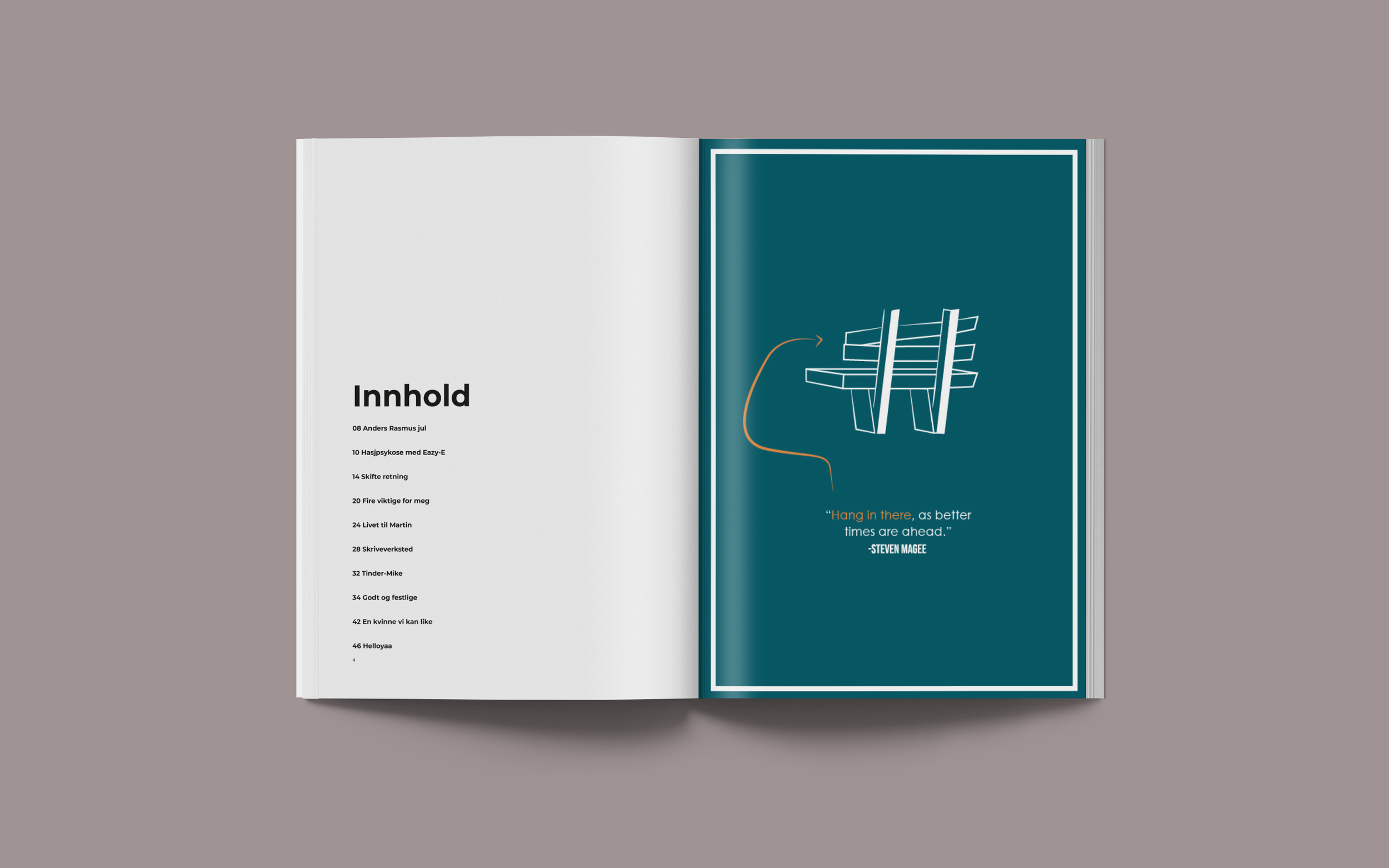
Egmont Euroman - A Fictional Editorial Design with Exclusive Expression
The task was to relaunch magazines under Egmont, with full creative freedom to redefine its visual expression — while maintaining its original target audience. The goal was to elevate the magazine’s look and feel, positioning it as a more exclusive, refined publication aimed at an upper high-class readership. The redesign focuses on editorial sophistication: clean, intentional layouts with a strong sense of structure and visual rhythm.
Typography played a key role in this transformation. Careful font selection was used to bring elegance and authority to the page, while the first letter of each title or section was subtly enlarged to add a classic, editorial touch — a nod to timeless print traditions.
Columns and paragraph styles were reimagined to create a more dynamic and engaging reading experience. By playing with hierarchy, spacing, and typographic contrast, the design introduces a visual richness that feels both modern and thoughtfully curated.
The result is a magazine that feels elevated, polished, and visually compelling — a new expression for the brand that stays true to its audience, while embracing a more sophisticated design language.