Bloom & Brew – A Brand Identity in Minimalist Expression
bloom and brew is a café built on two simple pleasures: flowers and coffee. Centered around the romantic essence of the rose and the craft of organic, flavorful brews, the brand reflects a quiet balance between beauty and depth — a place where every cup and every bloom is thoughtfully considered.
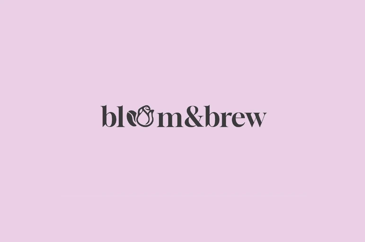
The logo is a visual blend of the café’s core — incorporating a rose and a coffee bean in place of the two “o”s in bloom. This subtle detail keeps the mark minimal yet meaningful, highlighting the brand’s two pillars without overwhelming the design.
Typography is set in bold, all-lowercase — a choice that softens the tone while maintaining presence. It communicates professionalism and clarity, while still feeling warm, grounded, and approachable. The color palette reinforces this sensibility: soft, romantic tones chosen to reflect a brand vision rooted in care, calm, and quiet confidence.

Loyalty Card
Even the loyalty card becomes part of the experience. Featuring the logo and its symbolic elements, it’s more than just a rewards program — it’s a small gesture of gratitude, showing how much the café values its community. With each stamp and each cup, bloom cultivates more than loyalty — it nurtures connection.